Friday, 21 December 2012

Skype Call: Creating Logo's

Me and James decided to have a skype call and continue with our work on the "Logo's", this will help us finish the logos. James and I are currently working on the "J.R.L" logo, this production name however has been changed to "Watchmen Films". We both agreed on this name as we thought it would be better than "J.R.L" as the it did not have enough meaning. In addition we thought out to change the image of "Watchmen Films" to an image of Lee standing and looking out the window. Here is an image below to show what the process looks like to make the "Font" of the title, that is "Watchmen Films":

As you can see here James is on the a word document finding the suitable font for the title of our production company name.
Along with this James created the image for this, this image was Lee standing near the window and the background is darkened making Lee stand out as a figure of the production company image. James then went on to take this image and change it into a "Sketch" like effect making it seem that it has been hand drawn.

The image above demonstrates what effect has been used to create the "Sketch" like effect. What this creates is a cartooned stamp that has been manipulated to fit our film.
James then sent over the "Watchmen Film" "Font" in a word document to me and additionally he also sent the image. We agreed that I would put together the "Font" and the "Image" together, creating one image leaving me to complete the production logo.

Here is the print screen of us on skype, what we are actually doing in this image is James is sending the "image" to my hotmail, in order for me to edit the "Watchmen" title together with the "image" he sent me.
Here are the fonts that James picked out to look at, we came to an agreement with the 3rd title from the top. We believe that this font can stand out and yet give a stylish perspective from it.
This print screen is of James sending the "Image File" and the "Font file" to me. 
This Production logo should be finished within this weekend and will be posted within weekend. We have more production logo's to come, such as: "Bite Productions" and the newly updated version of "Changing Arts Production", we hope to have this finished very soon and also bring our whole production to a close.

logo skype #2

After discussing 'J.R.L film' me and Rudi have decided to rename the company 'Watchmen Films' as it suits the logo much better and sounds catchy, we both believe this is a better name. With the 'Screen Sharing' option on Skype Myself and Rudi have looked at different fonts on Word to use with the new name, I looked at a few and typed them into Word for Rudi to see. After looking at the options we both decided to use 'Copperplate Gothic Bold' as we think this looks neat and stands out.
I had trouble getting the font onto the picture as I do not have Photoshop on my computer or any other software, Rudi asked me to attach the document to an email to send to him as he has photoshop and could easily change the colour to white and add it to the logo.

I have print screened the Word document I created, Copperplate Gothic Bold is the third font down:


Logo and Skype

Myself and Rudi have been discussing our logos over Skype whilst we both create separate logos, Rudi has been editing a shark logo on photoshop with my video feedback and I have been doing the same with our J.R.L logo on an iPad application. We have both decided to keep the majority of our logos black & white instead of colourful as we believe this looks less cheesy and suits the grim style of our film.
I wanted to create a better logo for our 'J.R.L production' company so looking back at our old photo-shoots I rediscovered a photo that I had taken of Lee looking out a window (back facing the camera) which we didn't use for our trailer/poster/magazine, I released that this would make a great production logo with a few editing touches such as darker, cropped and with text- Myself and Rudi are redesigning the picture over the Skype call.
Also me and Rudi have decided to rename 'Shark Bite' to 'Bite Production' Rudi suggested the idea and we both agreed it sounded better. Rudi had animated a photograph of a shark with a black & white effect but we didn't have any text, so Rudi looked through many fonts and we found a few 'surfer style' texts and realised this would suit the shark logo. Although the logo doesn't suit our films style we noticed that most production companies work in different genres such as 'Warner Brothers' who are famously known for Looney Tunes films and animations such as Happy Feet but have also worked with The Dark Knight, Blade Runner and Matrix.
During our Skype call we contacted Lee and have decided that we will all meet tomorrow afternoon to (1) include the logos into our trailer and ensure the three of us are happy with the final product and (2) begin creating our electronic evaluation with speech and video.
Tomorrow is the last day the three of us can meet for at least 10days as Christmas is this week and the three of us have released we will be very busy with family events,  this is why tomorrow we aim to get at least half the evaluation done and the other half at the end of the holidays.

I have taken a few pictures of what Myself and Rudi have been up to-


Thursday, 20 December 2012

Update

The three of us have been creating the logos for our production companies and have been improving on our previous ideas, I will be emailing Rudi the logos that I have created and Lee will do the same, Rudi will then place them into our trailer.

During the Christmas holidays the three of us plan to meet and start creating our electronic evaluation based on the work we have been doing the last few months and we hope it will be finished in January.

Monday, 17 December 2012

Poster Photos

On Saturday me and Rudi decided to take the new photos for our poster, we had the idea of having a lifeless hand laying on the ground surrounded by scattered diamonds. We hope this will show that a person has been killed whilst holding these diamonds as they have been shot and fallen to the floor. The photo is taken above the hand and looks down at the mess, this way you cannot see the person and only the lifeless hand whilst also giving an effect as if a spirit is leaving the body (I have seen this in in TV dramas where a camera pulls  away from the body in a similar to the famous opening of the show Eastenders).
As Lee could not make it I took the place but as our hands are different I had to wear gloves, I crouched down onto the floor and laid my hand on the ground and used the other to hold a torchlight whilst Rudi took photos. My legs began to ache as I was crouched for a good 10 minutes whilst the photos were being taken, it started to rain so we went indoors to look at the photos. At first we put ketchup on my sleeve to look like blood but quickly decided against it as it didn't look real, instead we will use photoshop effects.

We also created the logo for 'sharkbite' which is one of our production companies, Rudi managed to use his photo editing skills on a Google image photo of a shark to create a more animated logo to suit the company.

We will edit the poster soon and add it to the trailer, once this is done our trailer will be 100% complete and we will prepare to move onto our exam preparation.

Rise of the foot soldier trailer anaylsis

-The trailer for Rise of the foot soldier is a theatrical trailer; as it is 1:36 in length.
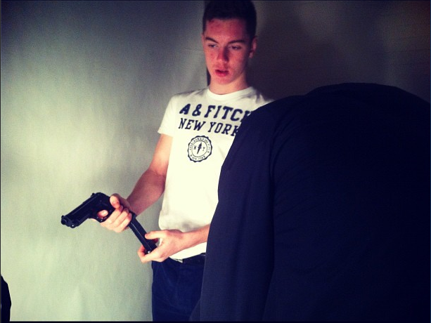
-It is a violent gangster action film.  I can tell its an action gangster genre from its violence and language used throughout the trailer.
-The representation for the film is certainly aimed at age 18+, the film was aimed to be back in 1995 from which the Rettendon range rover murders of 1995, the location was shot in London Essex.  The meaning of the whole film was over football at first, but then soon both the rival teams got into drugs and making money; then soon became disagreements over the drugs and violence began to break out.
-The production name comes up first in the trailer which is 'optimum releasing'
-At the end of the trailer there are no credits seen to the audience.
-In the trailer there is no release date given for when the film is due to come out, but just to make people think and wait until the film release date is given.
-The film has been given a certificate of age 18+ due to it's violence and crime, language and sexual scenes.
-In the trailer, there is a voice over throughout the whole trailer, which is giving us the audience information about the film and telling us what the film is about; and the structure of the story line, the voice used is from the main character 'Carlton' which is sort of voice that sounds like he is a dangerous person in the film who is one that gets into a lot of trouble.  Also the way he talks about violence sounds as if he looks for trouble with his gang.
-In the film there is two bits of dialog from the film one is explaining a drug deal that is going to take place and asking Carlton to come along and help out, and another bit of dialog is a man shouting out 'welcome to the neighbor hood' which tells us the audience that the place where the film is shot is a dangerous place and should be avoided.
-There is no point in the trailer where we as the audience are addressed to the film, just telling us the outline of the film and what it is about.
-In the trailer it starts with a rock sort of music to give the audience a feel of an action packed film which would create a feel of suspense for the audience.  Then towards the middle drum beats start to kick in to warm us of danger approaching, and lastly towards the end of the trailer a slow song starts to play to give the audience the feel of shame and loss within the film itself.
-The editing pace is very quick; and scenes are very quick flashes across to the audience making us concentrate to be able to see all the flash images and scenes coming across the screen at us.  Then throughout the trailer it shows us slower and more story building scenes.
-In the trailer there is graphics and narrative text used, towards the end of the clip big white bold writing shoots into the trailer and fades out saying 'hooligan' 'gangster' and 'Legend' stating the main points in the film; that there are hooligans, gangsters, but among them all lays a legend.
-In some part of the trailer, the film is slowed down to show the impact on some of the violence that is taking place, also when characters are being introduced to the audience the trailer uses a freeze frame for a second; to give the audience a chance to be able to identify the character.
-The trailer uses a lot of fade in fade out effects when the narrative text comes into the screen.  Also there are a lot of flashes used within the trailer to show fast flash effects of violence to give the audience sense of a violent and fast pace film full of action, keeping us the audience drawn towards the film on the edge of their seats.

Mind mapping our magazine cover names

In class today we approached our magazine carefully, by planning it properly on the whiteboard in the room. Within this mind map we first started to find what other "well Known" magazine names had in common with each other, in terms of attributes and what there names give out to the audience that could help us with developing our own name.

When we did our mind map we chose the certain names that will be used within our trailer and for our magazine.

James Rose will be assigned to do the "J.R.L Production" logo and the "Pipeline Production" logo. I will be doing the "Arcane" heading out magazine and also I will be doing the "Sharkbite Production" logo


Tuesday, 11 December 2012

Creating Production Logos

Whilst Lee will create the 'Arcane' logo I have created a few logos for 'Pipeline' and 'J.R.L' film productions. Rudi will also create some logos and as a group we will choose the best logo for each company.

Pipeline- I searched online for different websites that help people to create logos and using these I have came up with a few different ideas. I also used two different different slogans and my aim was to create professional looking logos.

J.R.L- this company was created by the first letter from each of our names: James, Rudi, Lee as it is the three of us who are creating the trailer and we believed it was a good idea to create a company out of our names. For this logo I wanted to create a professional and smart looking logo so by using Microsoft Word and various websites I have created a few different logos.

Below are some of the logos I have created for 'Pipeline' and 'JRL films' -


Company Name Ideas

Today as a group we have decided to create a few more production company logos to feature in our film trailer alongside 'Changing Arts Production'. We placed our ideas into a spiderweb diagram to look at and came up with many names based on our interests and words we like including names such as 'sunset production'. Once our Diagram was complete we setled on the names 'Shark Bite' as chosen by Lee and 'Pipeline' as chosen by me- we believe these names could be real film production companies.

During this process we also settled on creating a name for our Magazine, I believed it would be a good idea to have a name with a strong meaning but not a commonly used word, so it would be distinctive. I googled the word 'Mysterious' and after looking at different definitions came across the word 'Arcane' which means secret and mystic. I liked the idea of having a mysterious magazine name. We had a choice of around 10 different names and after going through each one we all agreed 'Arcane' sounded the best and decided this will be the name of our future magazine.

New Poster Idea #2

As a group we decided to reconsider our image for the poster as we thought that the image we currently had, didn't really help us in terms of how we could convey our film to the audience.

So we had a discussion on different locations and what we can do to incorporate our ideas within this location. Our final agreement was to take our images elsewhere, like the woods for example, as the woods feature in our trailer making it seem logical to do so.

We had couple of ideas for what we can do, and here are our ideas-

1: This idea was to have a person with there hand, palm up from the floor in the woods, the palm would contain diamonds that will be over flowing from each side of his hand. We will keep the hand there, in the background we will have a blurred shoe running out of the frame in the image, making it seem someone has just been killed.

2. This second idea was to contain the same features than the first idea but without the "person running", this idea would be a 'Birds Eye View' of the palm with diamonds on it but with the mud and the leaves on it, to create the "Dirty" in "Dirty Diamonds"

3. The last and final idea was to create an image where the diamond will be in between the two characters, the two characters will be shot in a "close up" of the face, allowing the the audience to think that there is conflict between the two characters for the diamond.

We are hoping to achieve this by Saturday 15th December, Lee and James will get the train to my house where there are woods near by, therefore getting the images that we need to play around with.

Friday, 7 December 2012

Extra scene

As a group we wanted to not only extend the length of our trailer but to also highten the suspense of the film. We came up with the idea of showing a gun (Shown in Rudi's recent post) being loaded but without showing the persons face so it remains a mystery of who is the gun holder- this fits perfectly with the gun shots at the end of the trailer and the viewer doesnt know who has loaded/fired the weapon.

Today we filmed this scene so Lee bought his brothers BB gun into lesson (plastic but realistic looking gun) and the three of us filmed him in the photography department. We also took this opportunity to take photos of Lee 'Dirty Dez' holding a gun to use in our magazine cover if they look good.
*In order to not scare anyone Lee kept the toy gun in his bag away from view when not in use*

We used the photography departments lighting equipment to help improve the quality of the footage and photos of Lee which worked very well. In all the three of us spend around 30minutes experimenting with different shots of Lee in the studio, in this time I also managed to take a couple of behind the scenes photos.


Thursday, 6 December 2012

New Scene, New Prop.

Our main influence to have this gun in our footage is to have a related prop that relates to the sound of the gun shots in the trailer. We really had to put an extra scene in the trailer anyway, as the time of our trailer is very short. 

As a group we assessed what we could incorporate within this particular scene, we had a group discussion and thought that it would be relevant to add a weapon that suggests that the film contains violence and a sign of firearms. 

This is a new addition to the props as we had to make a new scene to insert into our current trailer to lengthen it.

Monday, 3 December 2012

Risk Assessment

The risks that were involved in the making of 'Dirty Diamonds' was a very risk in terms of where we filmed of locations. The highest risk we had to endure was the cliff scenes.


We have some images to prove some of the hazards:

Here is the caution sign that we saw during our visit to the cliff, giving us an idea of what to expect when we get there and what we shall avoid.


Here is an example of how high the cliff edge was. We avoided this by having boundry of how far we can walk on the cliff.